Explanations for 2006: Why I am a liberal, or, Napkins are a stupid place to make government policy
Arthur B. Laffer famously scribbled his "Laffer Curve," describing how government revenues might actually increase following a tax cut, on a napkin. In theory, that goddamn napkin has been the excuse for every Republican tax cut of the last 25 years (although in the past couple of years Republicans have stopped bothering to justify themselves). Well, the Congressional Budget Office recently conducted a rigorous analysis of the hypothesis, and it turns out it's crap (PDF).
(Good explanation of the Laffer Curve's history and the importance of this finding from the CBO. "Crap" meaning not "completely ridiculous as a theory," which I am not competent to judge, but "totally irrelevant to the real world we live in.")
As I've said in the past, it's a little sad when you have to count the recognition of a common-sense truth (like the fact that cutting taxes decreases government revenue) as a victory. Still, in theory this forces small-government conservatives to defend low taxation on its merits: either taxes and government are evil and immoral in themselves (the idea the right-wing noise machine has been trying to cram down our throats for 25 years or so), or in utilitarian terms less government and lower taxes benefits everyone more than high taxes and more government. I can't answer the first, it's just too stupid. But in utilitarian terms, it's pretty obvious.
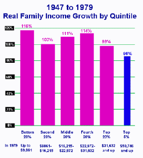
The first period, 1947-1979, was one of high taxes and active government. The second was one of low taxes and decreasingly active government. Most people benefited more during the first of the two.
If that wasn't enough, I believe that evenly distributed economic growth also offers more non-economic benefits to more people (in the form of social stability, opportunity, advancing equality, and tolerance) than unequally distributed growth, as argued by Paul Krugman here or by Benjamin Friedman in The Moral Consequences of Economic Growth. (Reviews here and here.)
That was really fucking boring, no? Maybe later I'll try to do something funny.
Tags: economics, income disparity, Arthur Laffer, Laffer Curve, taxes, tax policy, Congressional Budget Office, CBO, income disparity, Paul Krugman, Benjamin Friedman
Under various assumptions, the supply-side economic effects of the tax cut are estimated to offset between 1 percent and 22 percent of that revenue loss over the first five years and add as much as 5 percent to that loss or offset as much as 32 percent of it over the second five years (see Table 3). According to models that account for both supply-side and demand-side effects, those effects might offset somewhat less than 15 percent of the revenue loss over the first five years.
(Good explanation of the Laffer Curve's history and the importance of this finding from the CBO. "Crap" meaning not "completely ridiculous as a theory," which I am not competent to judge, but "totally irrelevant to the real world we live in.")
As I've said in the past, it's a little sad when you have to count the recognition of a common-sense truth (like the fact that cutting taxes decreases government revenue) as a victory. Still, in theory this forces small-government conservatives to defend low taxation on its merits: either taxes and government are evil and immoral in themselves (the idea the right-wing noise machine has been trying to cram down our throats for 25 years or so), or in utilitarian terms less government and lower taxes benefits everyone more than high taxes and more government. I can't answer the first, it's just too stupid. But in utilitarian terms, it's pretty obvious.


The first period, 1947-1979, was one of high taxes and active government. The second was one of low taxes and decreasingly active government. Most people benefited more during the first of the two.
If that wasn't enough, I believe that evenly distributed economic growth also offers more non-economic benefits to more people (in the form of social stability, opportunity, advancing equality, and tolerance) than unequally distributed growth, as argued by Paul Krugman here or by Benjamin Friedman in The Moral Consequences of Economic Growth. (Reviews here and here.)
That was really fucking boring, no? Maybe later I'll try to do something funny.
Tags: economics, income disparity, Arthur Laffer, Laffer Curve, taxes, tax policy, Congressional Budget Office, CBO, income disparity, Paul Krugman, Benjamin Friedman
posted by Antid Oto @ 10:23 AM
![]()
![]()


19 Comments:
At 1:58 PM, Solomon Grundy said…
I'm going to repost a comment from this good discussion:
Do Republicans really hold to two completely contradictory notions?
On the one hand, we're told that tax cuts 'pay for themselves' by increasing revenue a la the Laffer curve -- and increased revenue should hardly be a reason to decrease spending, should it?
But at the very same time, we're also told that tax cuts lead to decreased revenue, so now we have to 'starve the beast' of social services.
Does anyone else's head spin when they try to focus on this garbage?
At 4:43 PM, LL said…
Well, I'm going to be honest here and say that I have printed out all the docs and that I want to read through the CBO report. I've studied economics and I'm a libertarian which puts me in the fiscal conservative column. I'll get back to you on my opinion. It might just be technicalities because the biggest problem with people putting up charts and making blanket statements is that they neglect to let the reader know what parameters the charts are based on and how different variables are taken into account.
Yes, I look butch, but I'm a major geek. :D
At 6:44 PM, LL said…
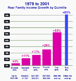
I don't have much time to do all of this, but I looked over the data.* The first thing that leaps out at me is that all data pre 1967 is extrapolated. The second thing is that women entered the workforce at a higher rate after the 70s. All the data is based on HOUSEHOLD income. The combined incomes of 2 adults working in a household can and will affect the numbers. The top 5% of the 2001 sample was about 5300 people. Out of those, almost 4500 was a married couple and almost 4100 of that 53w00 had 2 or more earners in the household.
*based on data by the Bureau of Labor Statistics and Bureau of the Census (Percent Distribution of Households, by Selected Characteristics Within Income Quintile and Top 5 Percent in 2001
Something to think about when looking at those graphs.
At 6:58 PM, Antid Oto said…
Wouldn't that imply that individual incomes actually grew more slowly for most earners after the 1970s, if gains in household incomes can be partially explained by many households gaining another earner?
At 7:15 PM, Antid Oto said…
And my point wasn't just that top earners did egregiously well in the last 25 years but that bottom earners did poorly compared to what they'd done previously. In making a utilitarian calculation of value, that's what would matter: how can government policy benefit the most of its citizens? If everybody still gained a lot I wouldn't be very concerned about the gains of the top 5%.
At 8:13 PM, LL said…
Yes, but I didn't bother to put in the numbers from the bottom fifth because the number of households with NO people working in it and the number of those households headed by women were egregiously high and I wanted to look more into why. I know that I have seen that social spending in the past year accounted for 54 or 57% of the total tax expenditure. I wanted to know what programs fell into that and how those numbers looked in 2001. Why were so many women, heads of households, not working and making that bottom fifth incredibly low in income? That's kinda what I mean by having to look at the whole picture. The Census Bureau provides the raw data. Then the big question is why, why, why?
And I'm not looking for a "Republican" answer because I think they're politics is a rash of shit. But then again, the Dems are the same way. Just my personal philosophy. Don't use politics to explain economic analysis.
At 8:24 PM, LL said…
Oh, and the reason I brought up the multi-income thing up is because the first graph that was up earlier ('47-'79) had a top 5% in the $50,000 and up range and the next graph is +$164,000. Again, why? And those are Family Income Growth charts, so I don't think individual income growth can be derived from that same data.
Sorry for my spelling and grammar mistakes. I'm a bit excitable about this as you can tell. *blush*
At 8:36 PM, Antid Oto said…
Oh, and the reason I brought up the multi-income thing up is because the first graph that was up earlier ('47-'79) had a top 5% in the $50,000 and up range and the next graph is +$164,000.
Well, this is what happens when you pull your graphs from half-assed sources: I don't know the answer. Presumably it's because the first is in 1979 dollars and the second in 2001 dollars, but who knows? I'll look into it some more and try to get a better source. In the meantime, this article does a more thorough job of at least supporting the argument that low-income people did better in the 1960s than in the 1980s, in absolute terms. But it only covers 3 decades.
At 8:53 PM, Antid Oto said…
Also, the people in the bottom quintile from 1979 to 2001 are obviously not the same people as those in the bottom quintile from 1947 to 1979. For that matter, the people in the bottom quintile in 2001 are probably not the same as those in the bottom quintile in 1979. All I was relying on this poorly labeled graph and underexplained graph to show was that in the first case you have broadly spread growth benefiting most of the population a good bit, and in the other case not so much.
At 11:10 PM, LL said…
One final thing I wanted to talk about was that Laffer curve. The theory is sound and you can access Laffer's own explanation of his theory and curve at Laffer Curve
The big question is really are we to the left or right of that point of zero rate of change where taxation is maximized. I know that I am looking at Treasury dept info (sorry, it's hardcopy here in front of me) and it shows a +14.6% change in Individual Income Taxes between fiscal year 2004 and 2005 and a change of +47% in Corporation Taxes. If all the screaming about tax cuts is correct, why are those numbers positive (those are REVENUE numbers)? Death taxes was the only one that was in the negative (-0.3%). Could it be that more people are spending that extra cash? Creating new jobs through demand for goods and services?
I'm not an Economist. I have studied the topic a bit and I know that sometimes theory is just that, theory. But some of the evidence contradicts your assertion that cutting taxes is NOT good for our economy and growth in federal revenue.
---------------------
Oh, and btw, I hope you guys don't mind me playing here. If I get on your nerves, let me know. *grin*
At 11:41 PM, Anonymous said…
I have no way of knowing, having not done the analysis, but a simple increase tells you nothing about what revenues would have been in the absence of a cut. Of course the economy is stimulated and revenues increase, especially when you compare two years, such as 2004 and 2005, that didn't see any major changes in tax policy. The question is, does that stimulation make up for the basic loss.
I understand the theory of the Laffer curve, and I was careful not to pick a fight with it as abstract theory. But in the real world we appear to be clearly on the left of that curve; pretending otherwise makes no sense.
At 9:13 AM, Sildenafil Citrate said…
I have just read your explanation and I understood your viewpoint and I actually have some similar thoughts about you talked about on this post which I liked a lot!
At 11:31 AM, Viagra Online said…
Great chart, those comparatives are really good, but again those were 2006 numbers, wonder how the number behave for 2010.
At 10:20 AM, safemeds said…
I used the so-called Laffer Curve all the time in my classes and with anyone else who would listen to me to illustrate the trade-off between tax rates and tax revenues. My only question about Wanniski's version of the story is that the restaurant used cloth napkins and my mother had raised me not to desecrate nice things.
At 2:48 AM, www.guadalajara-3d.com said…
In my opinion everybody must go through it.
At 6:03 PM, price per head said…
Good article, read with great interest.
At 3:23 PM, call forwarding said…
Wonderful post. If only I'd of come across something as wise and straightforward when I was starting out! See you at the reading!
At 12:22 PM, Model Baju Muslim Anak Perempuan 2015 said…
article from a very amazing, Good Job, Thank you for presenting a wide variety of information that is very interesting to see in this artikle
At 6:04 PM, Anonymous said…
Well, I'm going to be honest here and say that I have printed out all the docs and that I want to read through the CBO report. I've studied economics and I'm a libertarian which puts me in the fiscal conservative column. I'll get back to you on my opinion. It might just be technicalities because the biggest problem with people putting up charts and making blanket statements is that they neglect to let the reader know what parameters the charts are based on and how different variables are taken into account.
goa gong pacitan
taman pinter yogyakarta
rumah bambu karangasem bali
Post a Comment
<< Home